With more and more apps and games competing in the app stores, getting your app at the top can be challenging. On both Google Play and the App Store, creative optimization is crucial to increase your app’s visibility and effectively attract your target market. As such, designing strong creative elements will help you stand out from the competition and get featured by the stores. In this blog, we’ll look at some handy tips and best practices to help you best optimize your app’s visual assets.
- Reflect the essence of your app with well-designed screenshots
As the most visible element of your app page, screenshots are often the first point of contact that potential users will have with your app. The best app screenshots should reflect the essence of your app, highlight interesting features, and showcase your app’s core functionality. With these tips in mind, you can design the best app screenshots to encourage users to download your app:
- Aesthetically pleasing screenshots will help you stay ahead of your competitors.
- Your app screenshots should represent the real in-app experience so that users get an idea about what to expect when they download your app.
Add short captions to more efficiently convey a message, but make sure to use large fonts for easy readability.
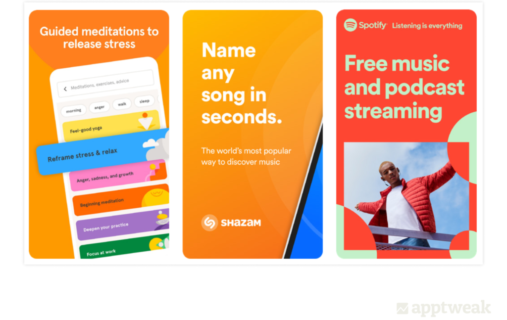
Screenshots with well-designed value propositions (Shazam, Headspace, Spotify).
- Choose the best image orientation (portrait vs landscape) for your app screenshots. For example, mobile games typically use the orientation that best portrays their gameplay. If the game requires users’ phones to be turned sideways, the screenshots are designed for landscape orientation.
- Connecting your screenshots with a storyline to highlight your app’s features is a great way to boost users’ interest.
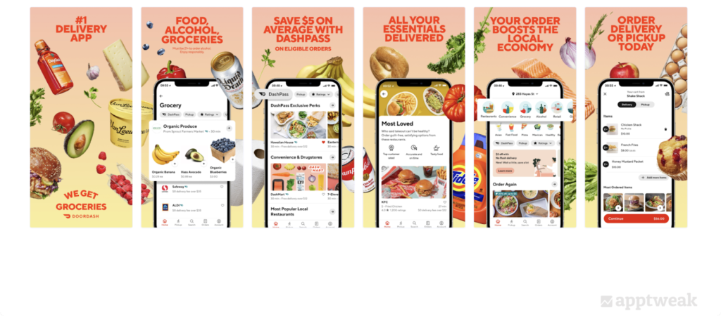
DoorDash uses their screenshot background to reinforce their offering and portray all the different food items customers can order via the app (US, App Store).
- Users have a short attention span, so try to make your first few screenshots catchy and illustrate the app’s main advantages.
- Use a visual pop-off if you want to zoom in on certain elements that you wish to highlight in your screenshot. This can be to highlight parts of your app UI that may be harder to distinguish on a normal screen size or something that you want users to focus on.
- If you want to go global with your app, it is essential to localize your app screenshots for target markets. Adapting your screenshots in the local language and designing them according to the cultural patterns of the region will help people identify more easily with your app and download it more.
- Competitor benchmarking is an effective way for you to check what the top apps in your category are choosing to display, and what’s working for them or not. To make your creative research optimal, you can use AppTweak’s Metadata Benchmarks feature to look at what other apps in your category are doing – analyze the average number of screenshots per category, identify icon trends in each category, discover which categories are more active in launching in-app events, and much more. You can take inspiration from your learnings and identify relevant opportunities in the market.
Last but not least, A/B test different versions of your app screenshots on both the app stores to find out which design elements, colors, text, and imagery convert the best and resonate most with users.
2. Design an eye-catching app icon that drives downloads
Your app icon is a prominent creative asset that appears throughout the store users’ journey – on the app page, top charts, search results, and featurings. Therefore, take the time to design a unique but also an effective app icon that communicates your app’s purpose and represents your brand. Some best practices to design a converting app icon include:
- Communicate the main objective of your app to users with a simple yet memorable icon. The best app icon is simple and easy to understand without confusing the user with too many details.
- Focus on a simple graphic in your icon, and only include text if it’s essential to convey a message. A cluttered app icon may leave the user confused.
- If users are familiar with your brand, we recommend incorporating your brand logo in your icon to increase your app’s credibility. However, if your logo is not commonly recognized, we’d recommend not adding it. In this case, a simple icon that describes your app will be more valuable than adding a logo.
- When it comes to app icons, it is necessary to ensure that the colors you choose align with your brand. While bright, vibrant colors can help entice users, using too many colors can have the opposite effect. It is advisable to use one or two main colors in your app icon.
- Updating your app icon to reflect seasonality (for example, Christmas, Halloween, New Year, etc.) can be very appealing to users. It helps users know that you are engaging with them and coming up with new features and updates.
- Much like screenshots, it is recommended to localize your app icon if you want to grow your app in international markets. With a localized app icon that reflects cultural designs, users on the app stores will feel more connected with your app. This is also a big opportunity to gain the upper hand in the competition and make your app icon stand out.
A/B testing your app icon can help you test different variants and implement the most effective one, leading to higher conversion rates. For instance, with AppTweak’s ASO Timeline feature, you can even spy on your competitors’ A/B tests on Google Play. This can help you find out how often your competitors run A/B tests and for how long, how apps or games update their icons for seasonal events, what changes they introduce in their tests, etc.

- Finally, make sure you’re adhering to the guidelines set by both Google Play and the App Store while designing your app icon. For example, Google prohibits including keywords in the icon that suggest store performance, or using graphical elements in the app icon that may mislead users about your app. Apple asks developers to remove any unnecessary features in the app icon to maintain visual consistency regardless of size.
3. Offer insights into your app with a great preview video
Your app videos are a powerful asset that help you catch users’ attention, showcase your app’s core features and gameplay, and drive conversions. Known as the app preview on the App Store and the promo video on Google Play, a good video can give users a great first impression of your app and provide an in-depth preview of what they can expect after downloading the app. A user who has downloaded your app after watching a descriptive video will be less likely to be disappointed by the reality, and thus less likely to uninstall after downloading it.
Both the App Store and Google Play recommend preview videos for games, but to decide whether you should create a video, keep the following points in mind:
- Consider the type of app or game you have. For games in the Action category, for example, preview videos are extremely common. But whether you want to follow category trends or not depends on your app marketing strategy.
- Secondly, figure out if you have the time, resources, or talent to create a nice app video. If you don’t have sufficient assets to create an effective app video, it’s advisable not to add one at all.
- On the App Store, you can prioritize videos even more than on Google Play. iOS videos play automatically and show before, or alongside, any screenshots you have in the search results. As a result, your video will be clearly visible and can impact your conversion rates in a big way.
- Ensure that your preview video is in the same orientation as the gameplay to set realistic expectations of gameplay for store visitors.
- Make sure to highlight legal specificities like age restrictions in your app video. Also, keep in mind that all audiences will be exposed to your videos, so avoid explicit violence, adult themes, or profanity.
- It is a good idea to add text in your video, as videos often play with any sound on mute, but make sure it’s easy to read in terms of speed, font style, and font size, flows seamlessly with the rest of your content, and is aligned with your branding. Google recommends limiting any title screens or other pre-rendered content and keeping 80% of your promo video to be truly representative of user experience.
The first 3 seconds of a preview video should immediately present the app’s value proposition or benefits to users. For example, you can grab users’ attention by starting off your video with a direct question and frame the problem your app will solve.
Additional visual assets to optimize for your app
Alongside app icon, screenshots, and videos, there are some other creative assets you can optimize on your app page.
Promotional artwork (App Store)
Promotional artwork is the banner image that apps and games on the App Store display at the top of their app page. Keep these tips in mind when designing this banner image for your app on iOS:
- Create artwork that is evergreen. This is because this creative can only be updated when Apple considers your app for a featuring and requests you upload the creative.
- Your promotional artwork should support your brand identity. Don’t add complicated gameplay or specific features to it. Instead, focus on your brand voice, values, and relevant context. Games can really leverage promotional artwork to highlight main characters or major storytelling elements.
Make sure your design appeals to all target markets, as you cannot provide a different image per locale. Do not include any text outside of the logo on the artwork.
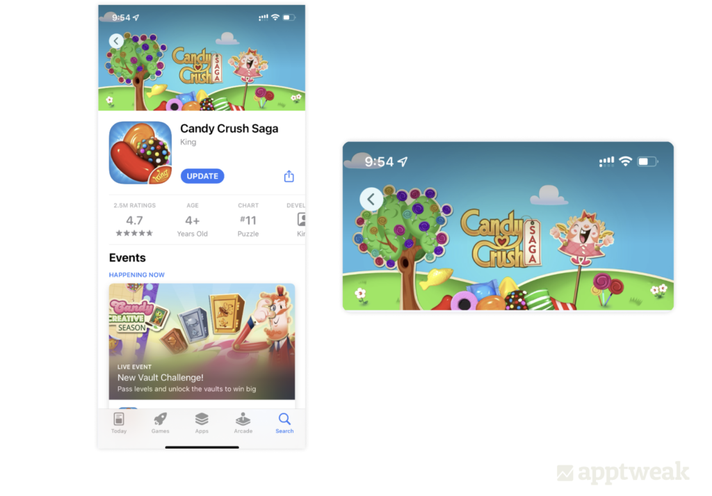
Candy Crush Saga has provided promotional artwork in the background of the product page on the App Store.
Feature graphic (Google Play)
On Google Play, feature graphics are a powerful tool to showcase your app’s features and functionality. They can be shown alongside your icon and app name throughout the store. We’ve listed some best practices for you to optimize this important visual asset:
- A good feature graphic should grab users’ attention and highlight your app’s core value proposition or storytelling elements.
Like promotional artwork, your feature graphic should be recognizable and durable. A wide variety of users who might have never heard of your app or game before can come across your feature graphic. So make sure to appeal to a broad audience and avoid highlighting time-sensitive promotions, as these will have to be regularly updated.
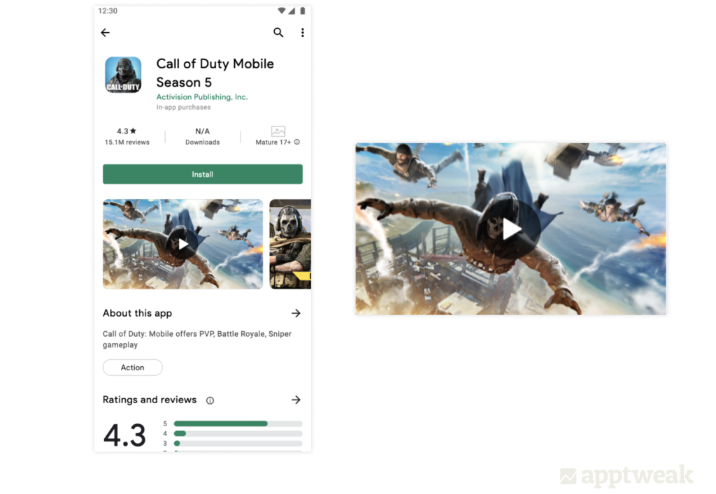
Call of Duty has provided context by showing the gameplay in its feature graphic on Google Play.
- Feature graphics appear rather small throughout Google Play, so make sure they are simple, legible, and easy to understand. Focus on a single element, keep captions short, and go for a large font size.
- Use bright colors to make your app or game stand out from the Google Play background.
- Localize your feature graphic for different target markets.
Follow Google’s policy guidelines and avoid content that suggests performance like ranking, user testimonials, or awards. Don’t include any price or promotional information, and don’t use words like “new,” “free,” “discount,” or “sale.”
Conclusion
It is fundamental to identify your app’s core value in order to design the most efficient screenshots, icons, videos, and feature graphics for your app. We hope these tips and best practices will help you create high-performing visual assets on both the App Store and Google Play. Well-crafted designs, coupled with knowing who your users are and what they want, can help you in your app creative optimization strategies.